Customizable WordPress Agency Dashboard: Widgets vs. Command Center Layouts
Two agencies, same platform, completely different mornings. One agency lives and dies by security — the first thing anyone wants to see is the malware scan summary. The other is entirely client-services driven — the first thing anyone wants is the ticket queue and who’s waiting on a reply. A dashboard built for only one of those workflows is, by definition, wrong for the other.
Table of contents
- Why one fixed layout never fits everyone
- Two layouts, one underlying data source
- What the dashboard actually connects to
- FAQ
- Signs your current layout is actually working against you
- What choosing a layout looks like in practice
Why one fixed layout never fits everyone
Every fixed dashboard layout is, implicitly, a bet on what its typical user cares about most. That bet is right for some agencies and wrong for others, and being wrong means the thing you actually need to see first is buried a scroll or two down, every single morning, forever. A dashboard that assumes there’s one correct priority order for every agency is solving the wrong problem.
Two layouts, one underlying data source
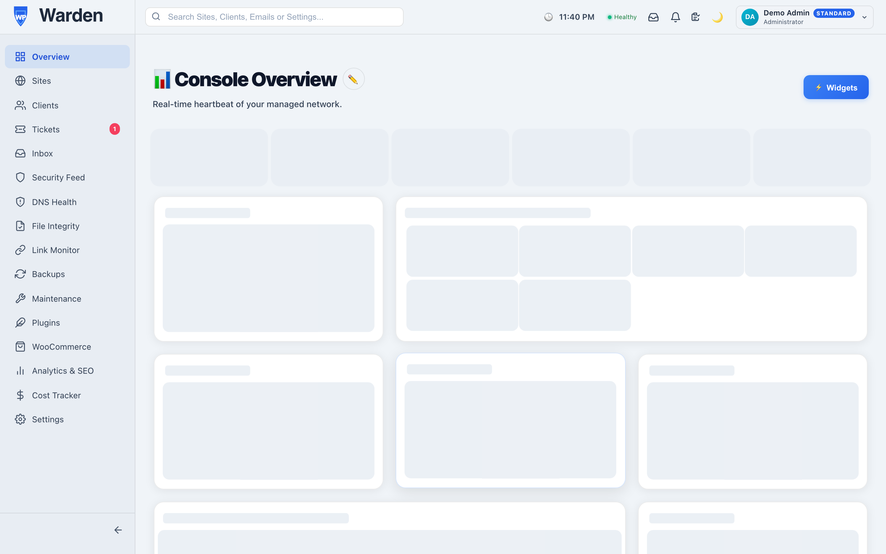
WP Warden’s dashboard ships in two forms. The classic dashboard is built from sixteen selectable widget types — alert summaries, fleet health, recent activity, and more — that you choose and arrange to match your own workflow. If you’d rather have everything on a single screen instead of a grid, the Command Center view presents the same underlying data across fourteen interactive zones, with a simple toggle between the two saved locally per user.
What the dashboard actually connects to
Neither view exists as a decorative summary detached from everything else — both are built directly on top of the same data every other part of the platform uses. From either layout, one click reaches a specific site’s full detail, an active alert, or a client record. The widgets summarize; the depth is always one click away, not walled off behind a separate part of the platform.
Signs your current layout is actually working against you
A dashboard layout that’s wrong for your workflow doesn’t usually announce itself as a problem — it just quietly makes every morning slightly less efficient than it should be, in a way that’s easy to normalize. A few signs worth paying attention to:
- You scroll past the same three widgets every single day to get to the one you actually check first.
- You’ve mentioned to a teammate that you “just check a different page instead” for something the dashboard is supposed to summarize.
- Two people on the same team have noticeably different mental routes through the same dashboard, because neither layout quite fits either of them.
None of these are dramatic on their own. Together, they’re a reliable sign that the default arrangement has stopped matching how the team actually works, and it’s worth a few minutes to rearrange rather than continuing to work around it indefinitely.
What choosing a layout looks like in practice
There’s no wrong starting point — the classic widget grid is the more familiar option if you’ve used dashboard-style tools before, and it’s easy to reorder as priorities shift. The Command Center view suits people who prefer everything visible without scrolling, at the cost of a slightly denser first impression. A reasonable approach is trying the default classic view for the first week, noticing which widgets you find yourself ignoring, and rearranging from there — the goal is a dashboard that reflects how your specific agency actually triages a morning, not a generic best practice.
FAQ
Can I switch between the two dashboard styles at any time?
Yes, a single toggle switches instantly, with your choice remembered the next time you log in.
Do widgets require separate API calls to load?
No — both dashboard versions reuse the same single widget-data endpoint, so there’s no extra performance cost to running either one.
Start a free 14-day trial — no credit card required.